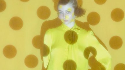

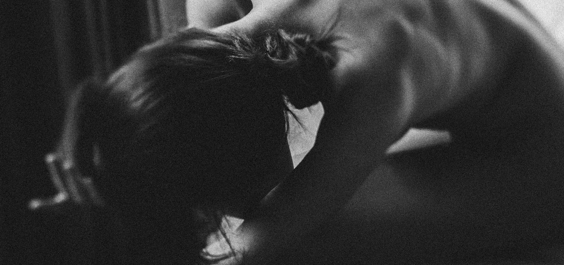
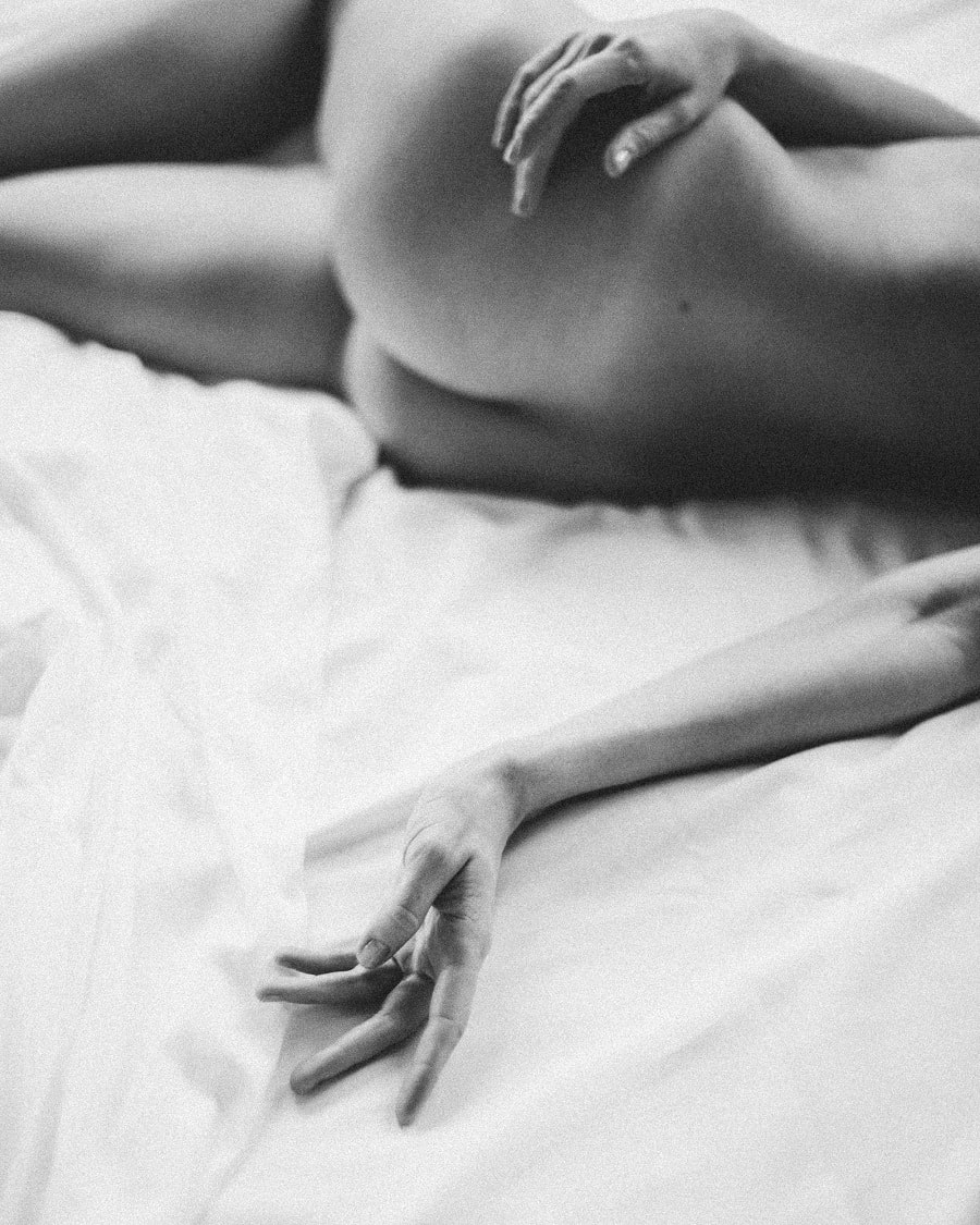
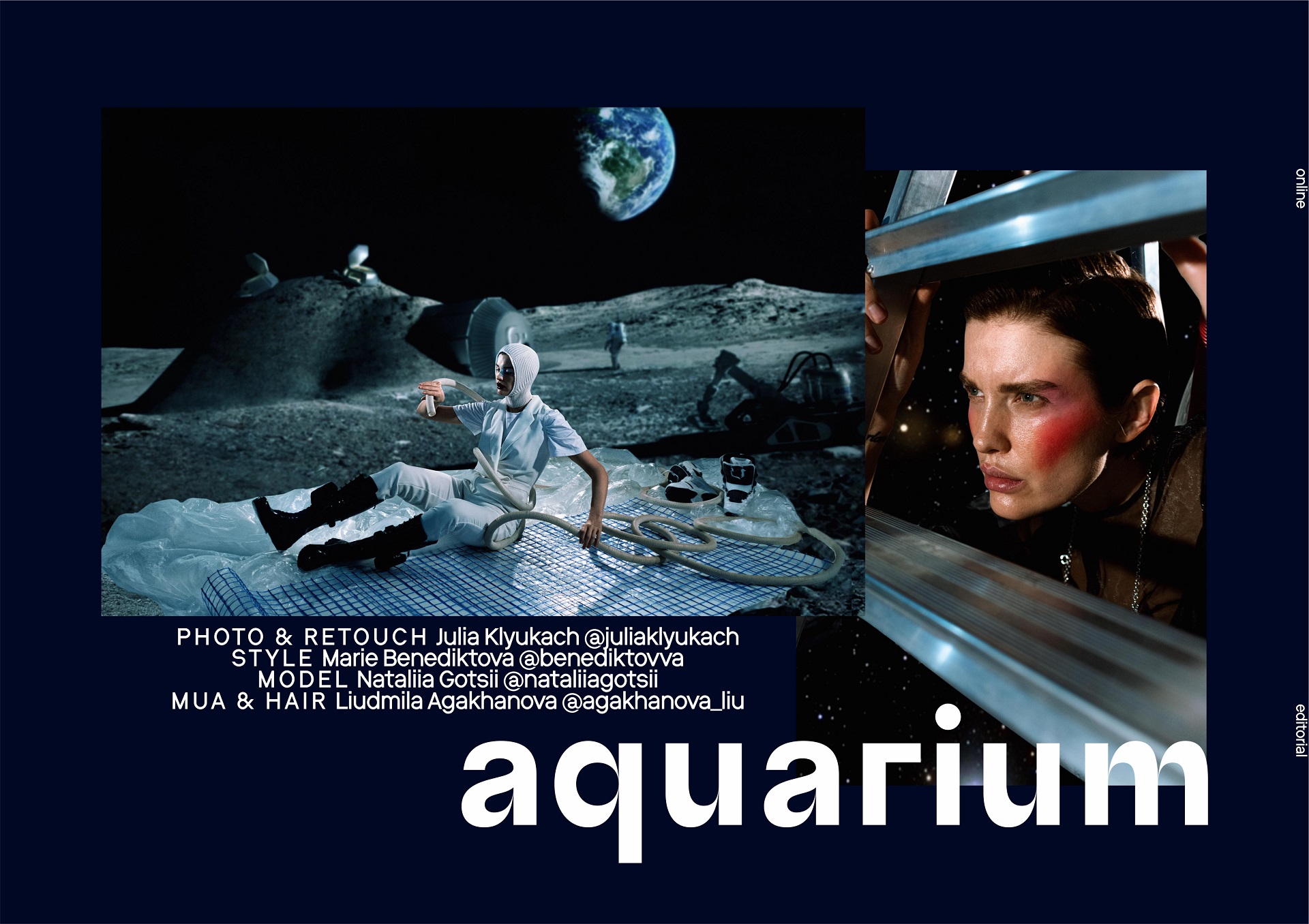
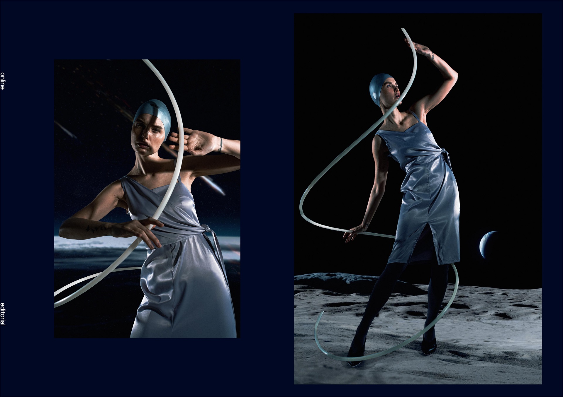
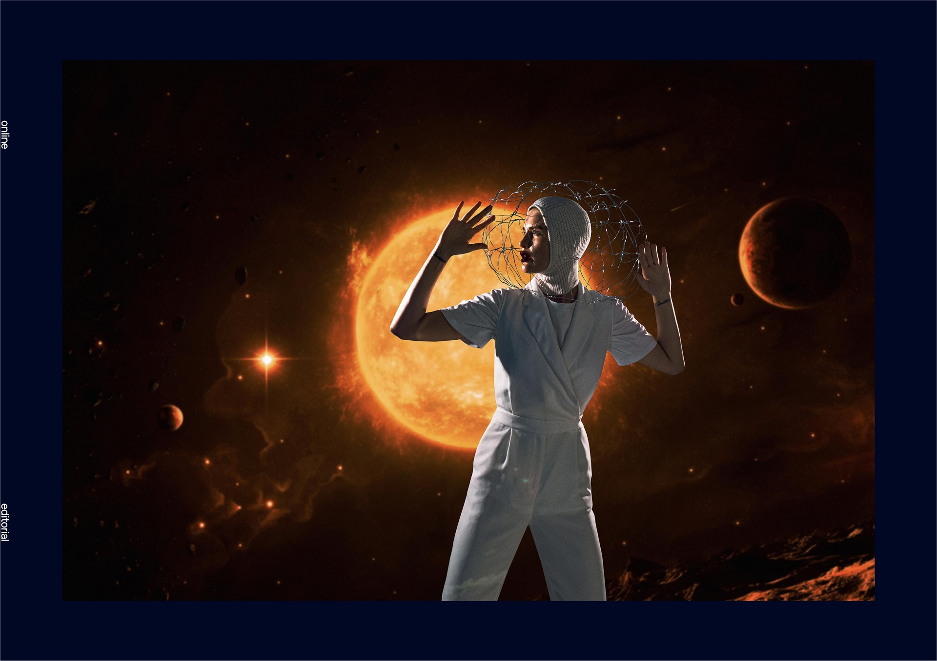
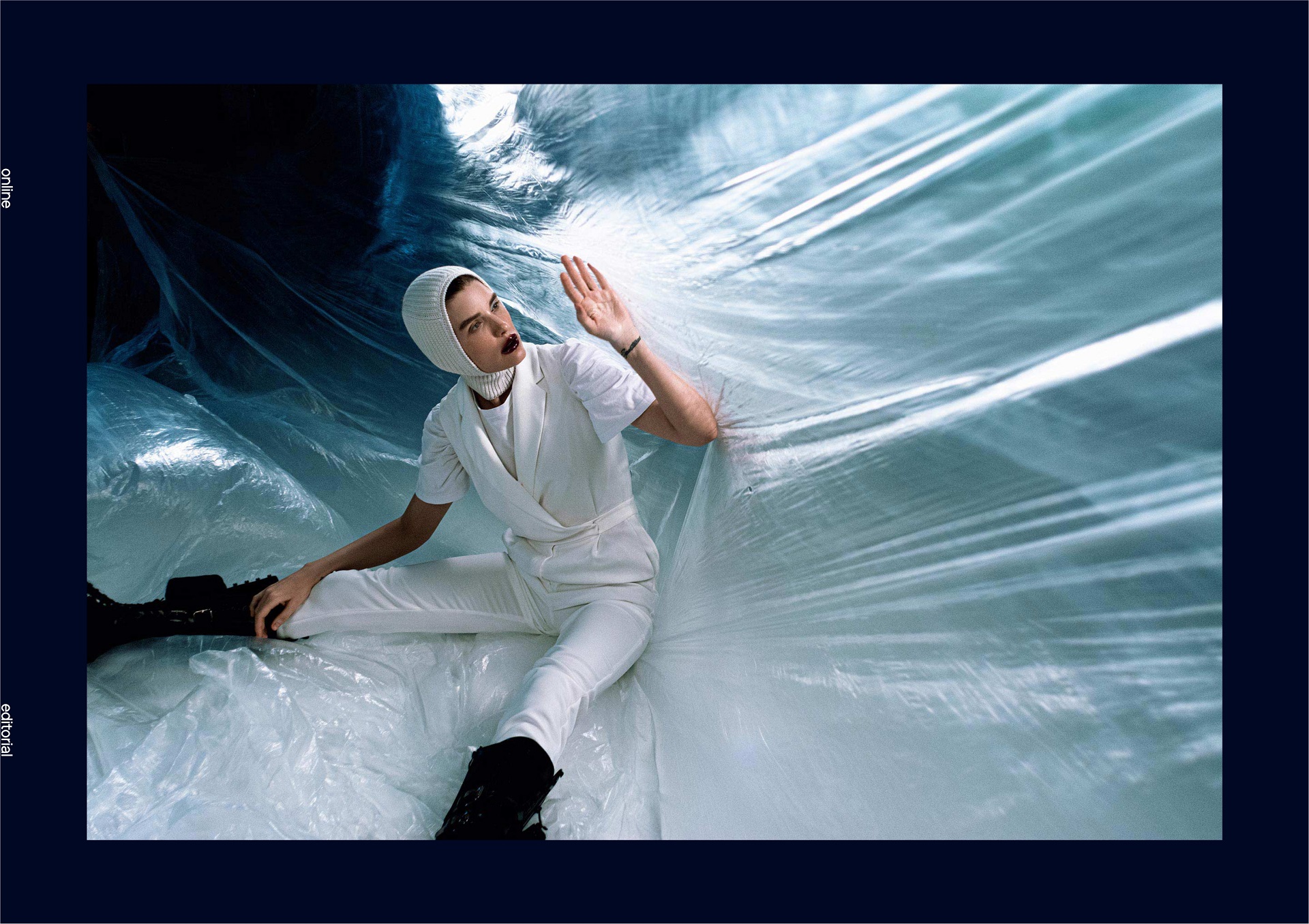
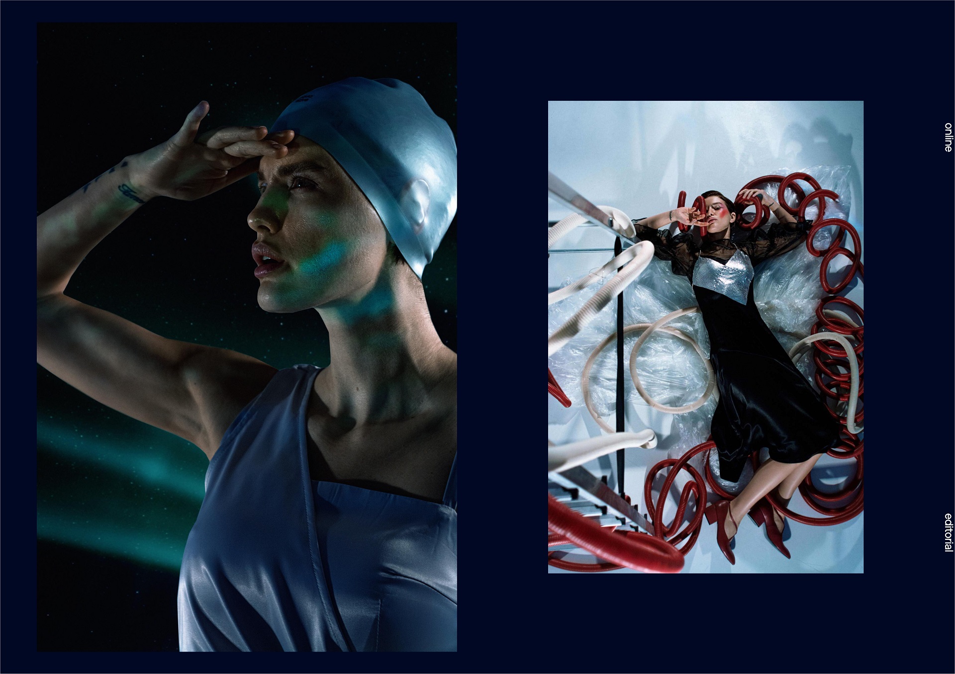
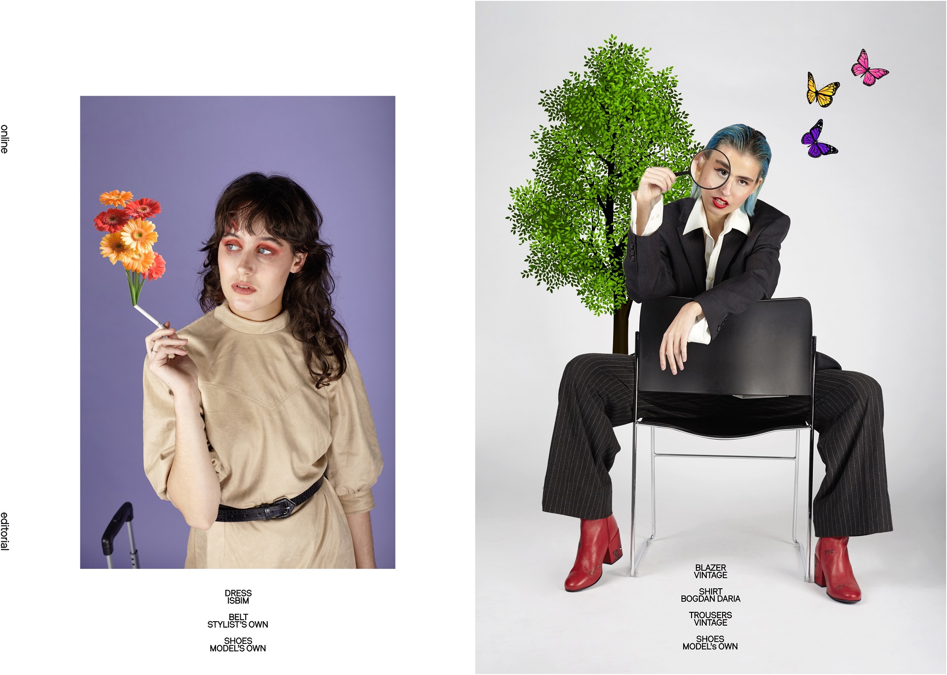
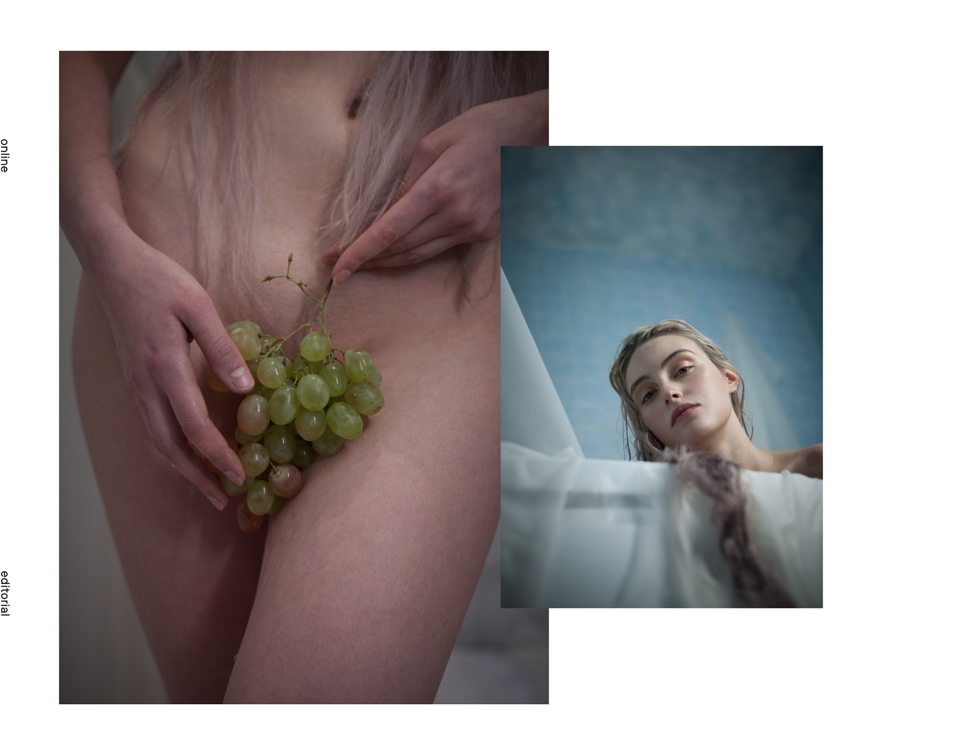
BA.U.HAUS
PHOTOGRAPHER: Lucy Leroy @lucyleroymarie
MODEL: Louise @hypsolinex @contrebande
MAKE UP: Caroline Alet @aletcaroline
STYLIST: Myriam Tighilit @myriam_tighilit
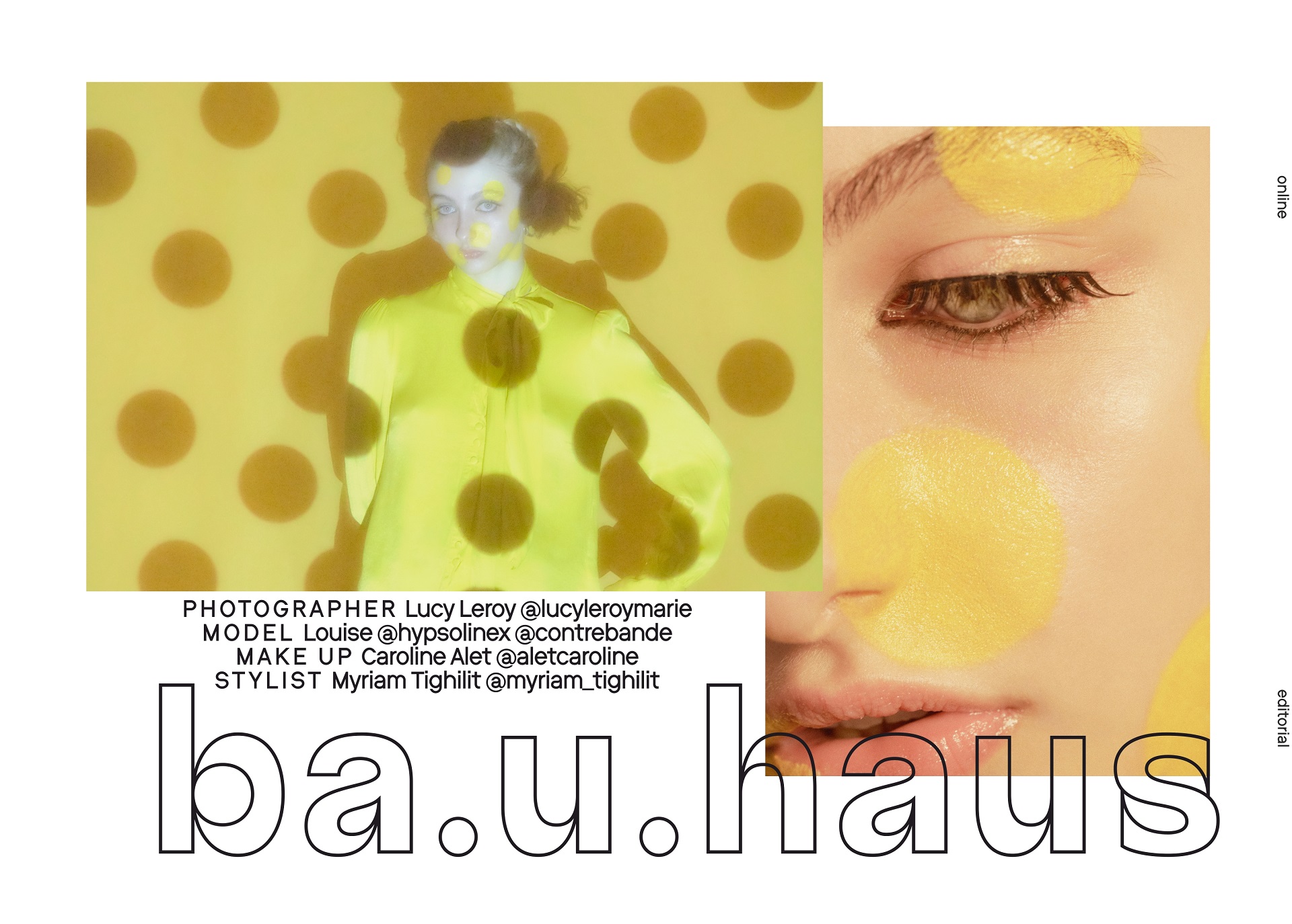


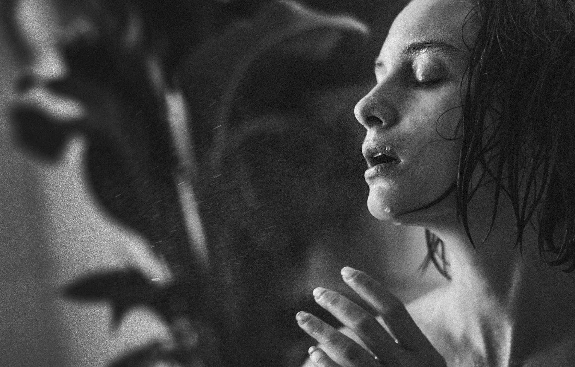
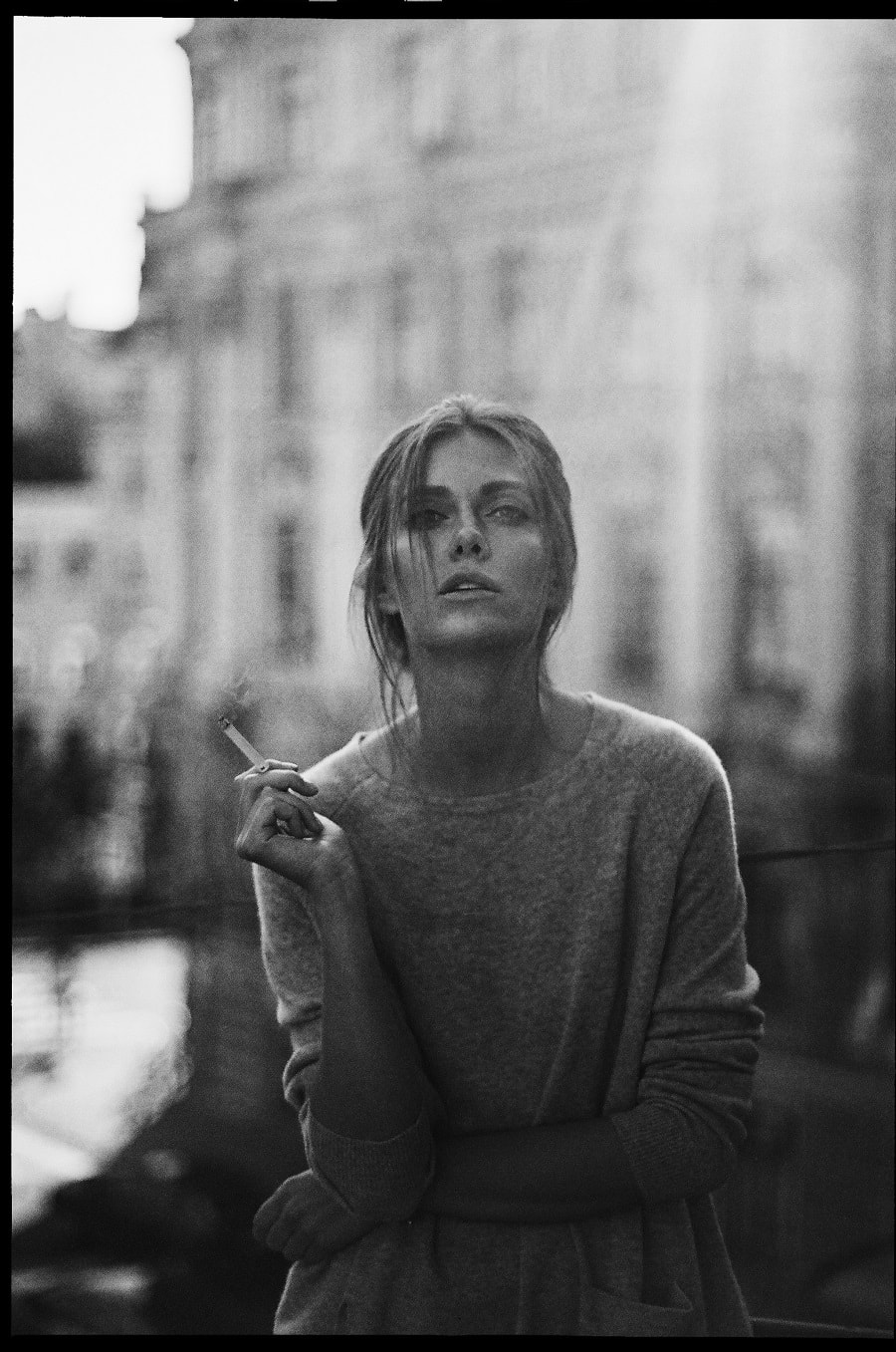
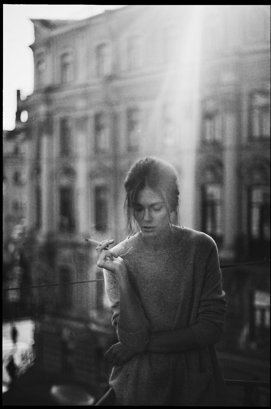
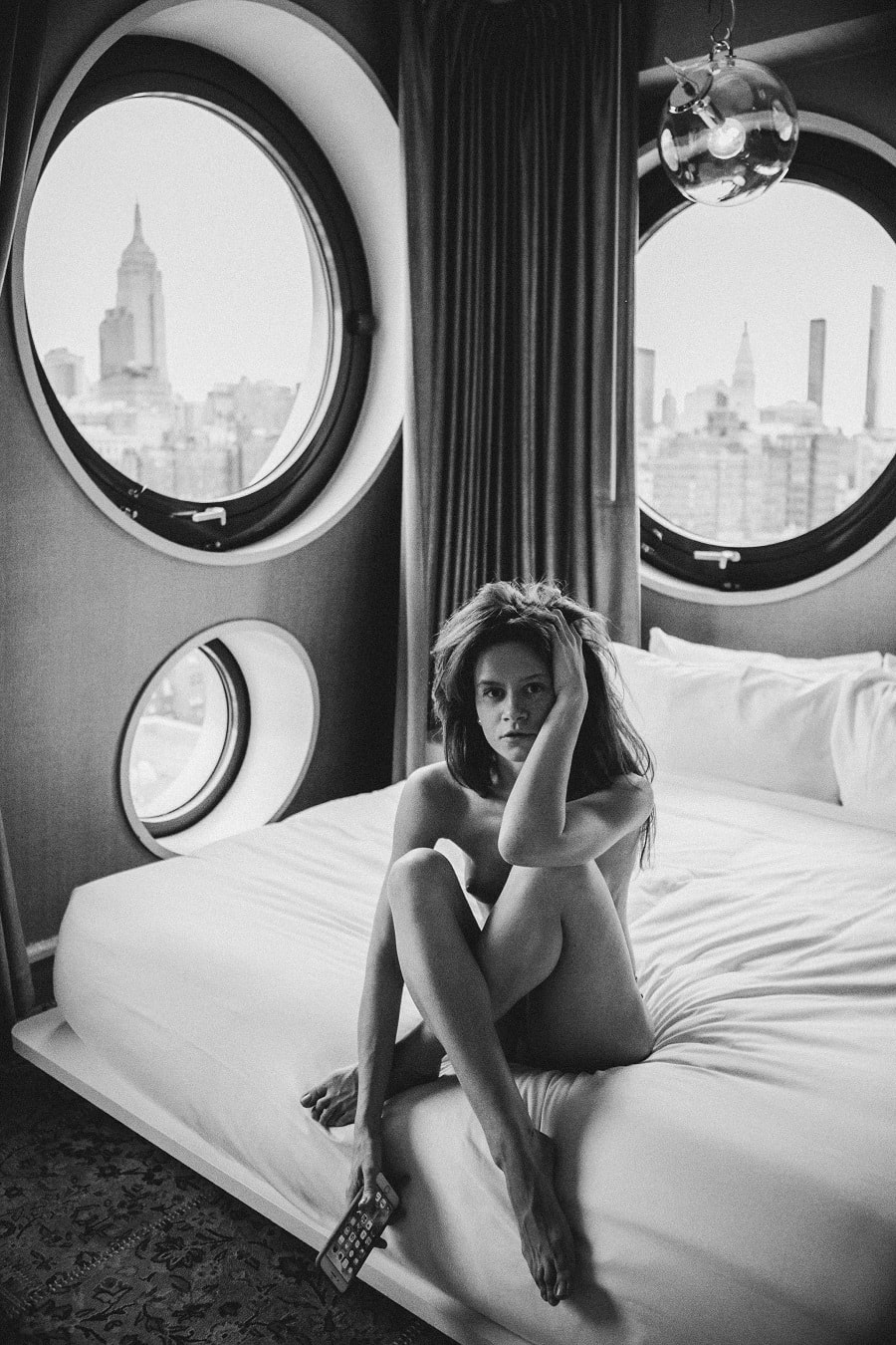
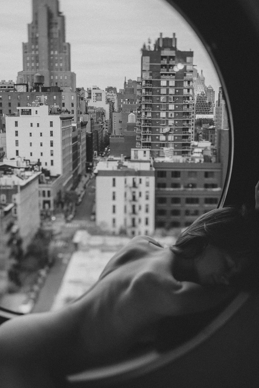
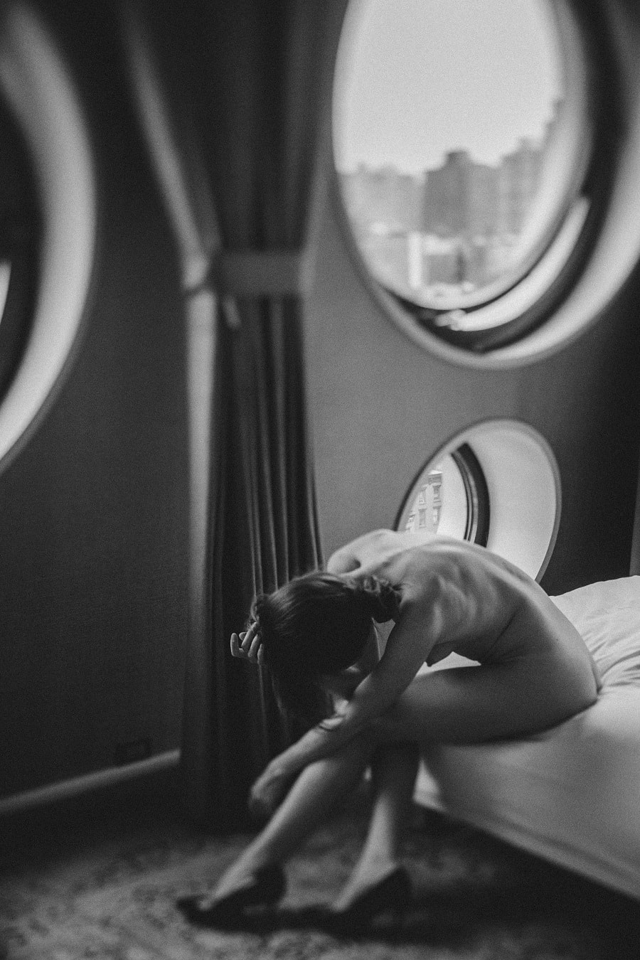
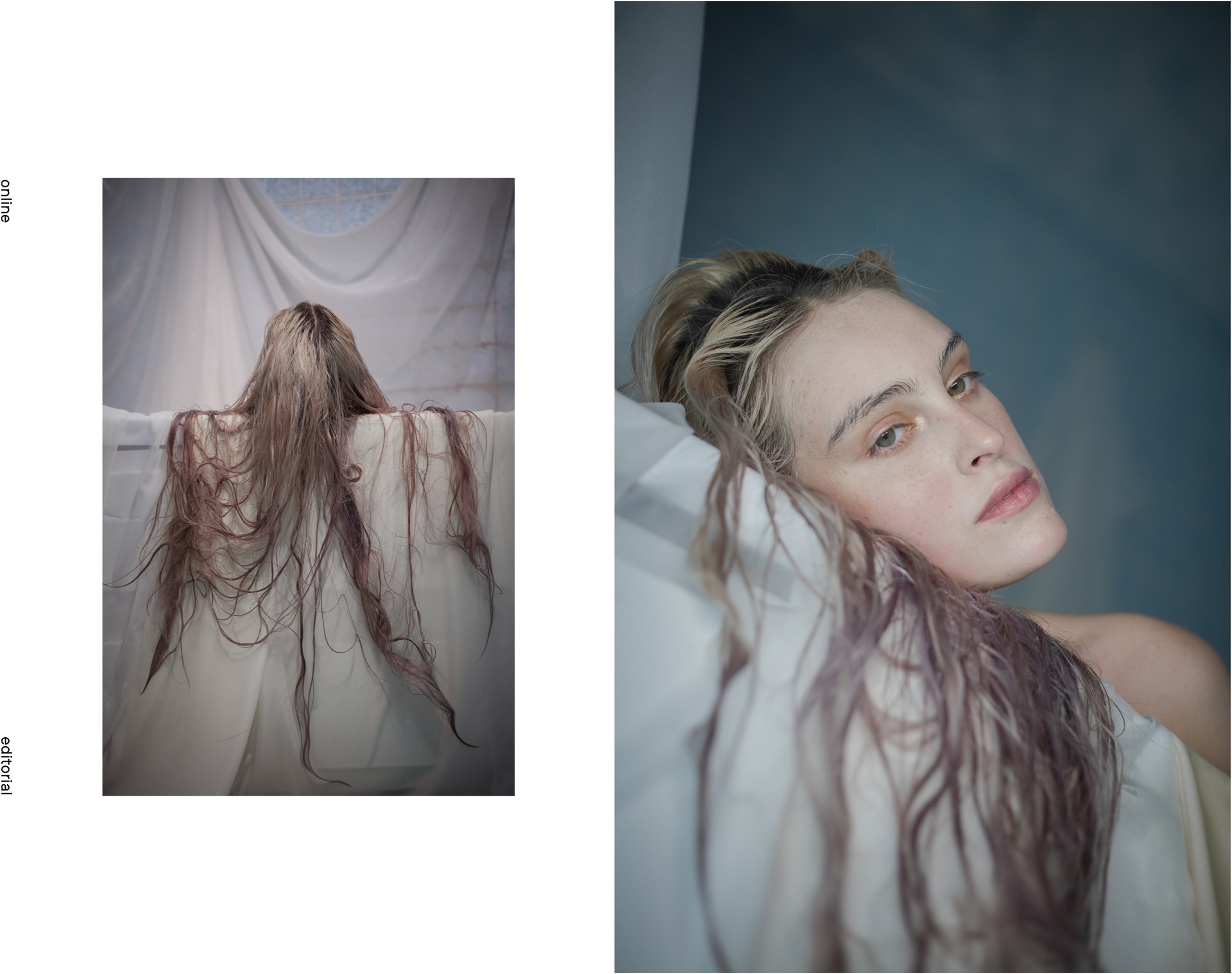
PHOTOGRAPHER: Lucy Leroy @lucyleroymarie
MODEL: Louise @hypsolinex @contrebande
MAKE UP: Caroline Alet @aletcaroline
STYLIST: Myriam Tighilit @myriam_tighilit

How did you get into photography?
I came to photography after I’ve been trained as an artist in Saint Petersburg Art
School Nicholas Roerich and Saint Petersburg Art and Industry Academy. I drew
a lot, was engaged in painting and design, but after a while I found a new
language for my ideas expression in photography. For over 17 years I’ve been in
love with this profession.
How would you define beauty in а paragraph or less?
One of the most important words for me is “beauty”. I can find it anywhere,
whether it’s a graphic monochrome of ancient building facades or freckles
gradient on the face of my model. Due to this ability, I easily find an inspiration
for the new projects and try to implement them as soon as possible.
Was there a pivotal moment when you decided to follow your passion?
My profession helps to combine art and travel, various shooting techniques and the
craziest ideas, colour and graphics. Since I discovered a black and white photo and
manually printed my first photo, I realized that this is a long term relationship.
Tell us about the spaces within which you live and work.
I am fed by two cities — St. Petersburg and Berlin. First one is my hometown and
second is a city of my dreams, where I’m lucky to live now. I also travel to Reykjavik,
New York and Paris quite often. These cities give me strength and energy to create.
Do you have a routine or rituals as you work?
Preparation for the shooting is very important for me: reference, location, light,
colour, style, detail and mood — i pay a lot of attention to all aspects. During the
working process I am very focused and I try to control everything. But only till the
middle of the shoot. Because after the main tasks are solved and everyone exhaled
I can shoot more freely and relaxed. Usually the truth is somewhere in between.
How would you define your personal aesthetic?
My aesthetics is subject to periods: now it is the purity of lines, idealism, harmony,
softness, a search for the decisive moment in combination with skill and
professionalism.
How important is the presentation of your work?
Presentation is also very important. During my work, I’ve built a strong brand that
clearly works in Russia. If this is a commercial project, the output is high-quality
printing, branding and a beautiful package. If this is an exhibition, I will arrange it
personally, because usually I know for sure what result i want to get.
Which artist of the past would you most like to meet?
My pipe dream is to get acquainted with Irving Penn, to assist him on the set to
understand his thinking process when he creates a picture. The versatility of his
work and periods — creative, commercial and magazine, his life and career path
are ideal for me at the moment. I am also inspired by artistic works of Auguste
Rodin, Pablo Picasso, Piet Mondrian.
Can you tell us about the process of making your work?
Before starting the work, I always collect a reference, seek the the colour I
paintings, I look over contemporary art works. I form a team of like-minded
people for each shooting separately. I try to do my best.
What advice would you give to a young artist following in your steps?
The main advice for a junior photographer is the same as for a junior artist. Shoot,
watch, burn and shoot again. Search for your own style, handwriting, language of
embodiment. When you have something to say in art, the rest is just a matter of
time.
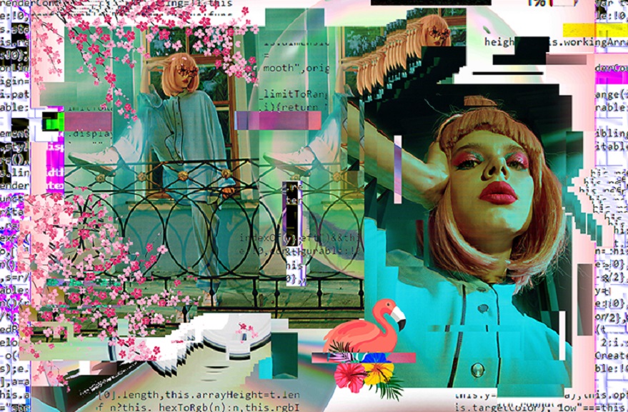
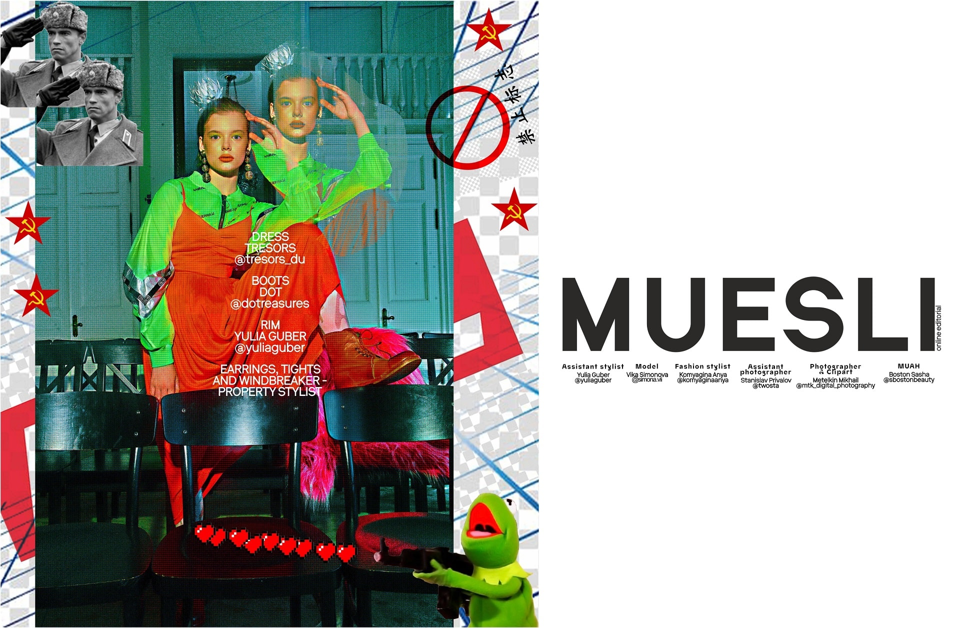
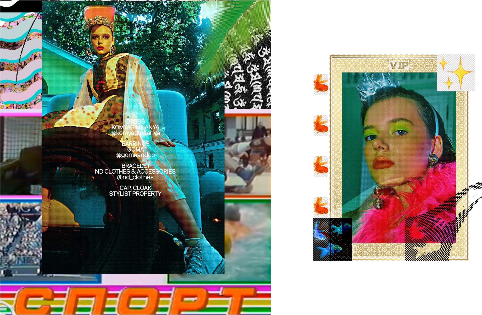
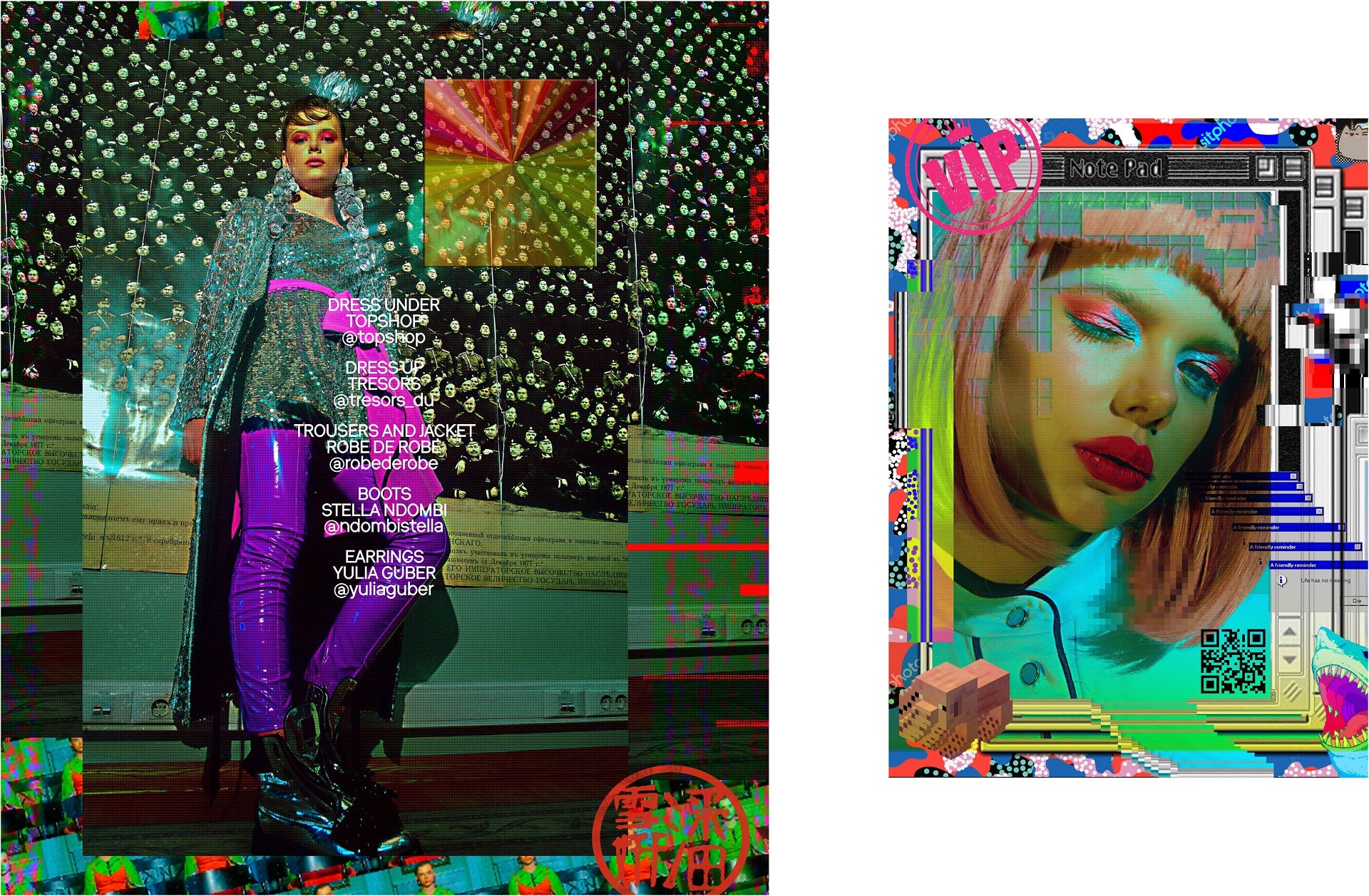
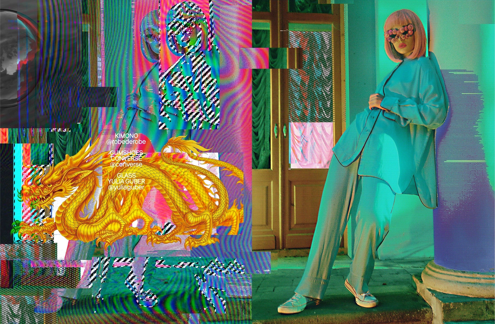
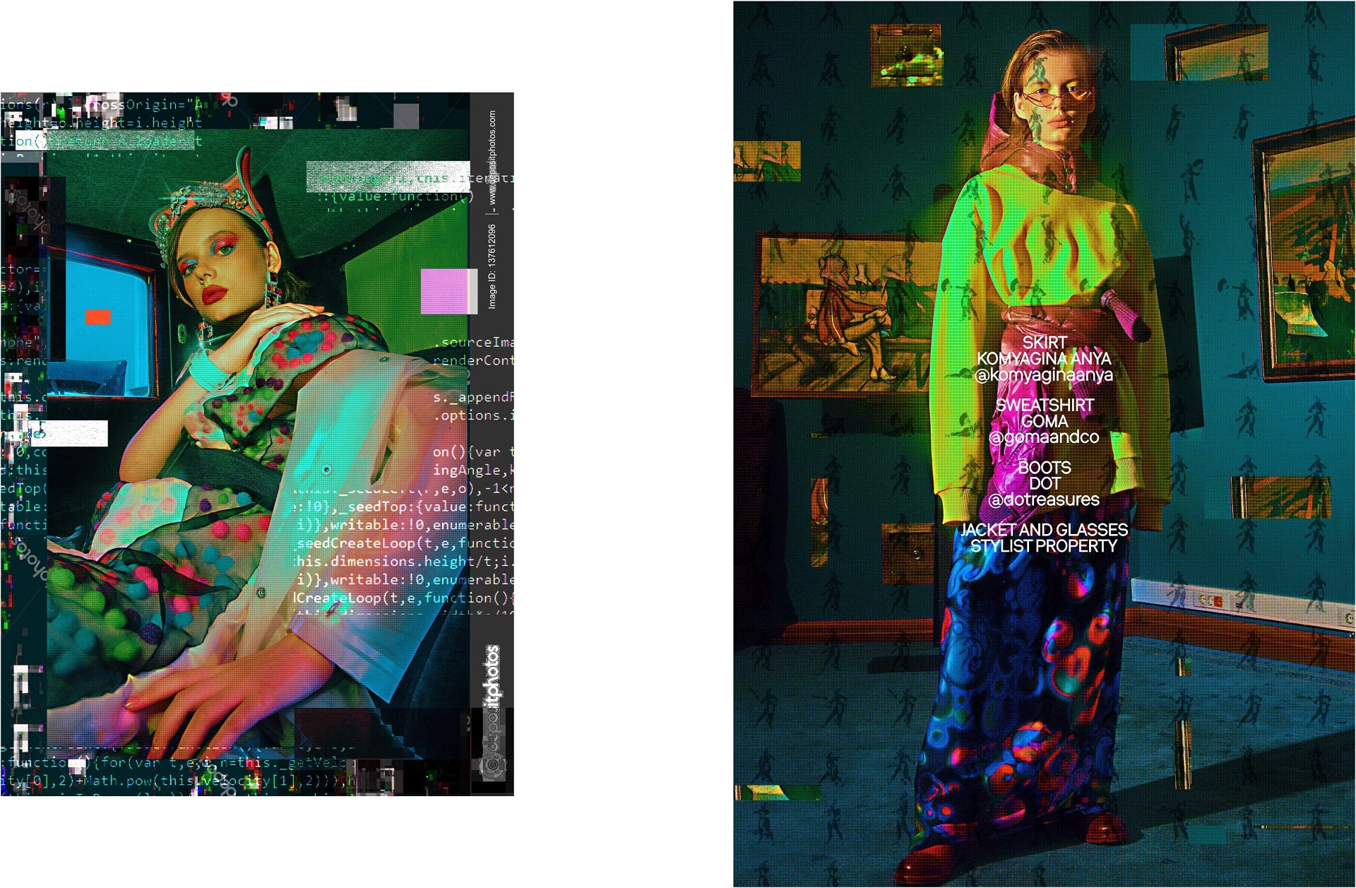
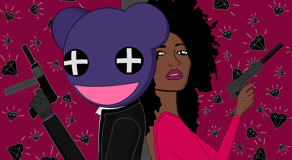
Photographer & Clipart: Metelkin Mikhail @mtk_digital_photography
Assistant photographer: Stanislav Privalov @twosta
Fashion stylist: Komyagina Anya @komyaginaanya
Assistant stylist: Yulia Guber @yuliaguber
MUAH: Boston Sasha @sbostonbeauty
Model: Vika Simonova @simona.vii
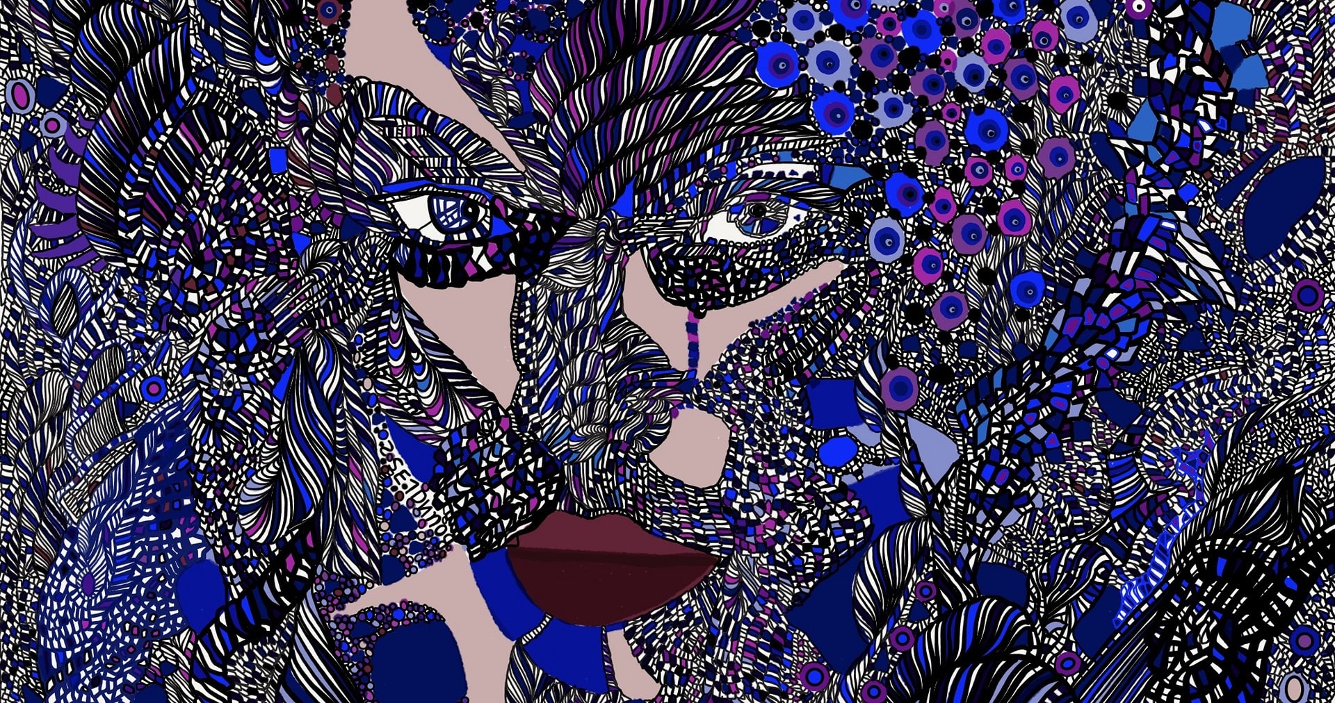
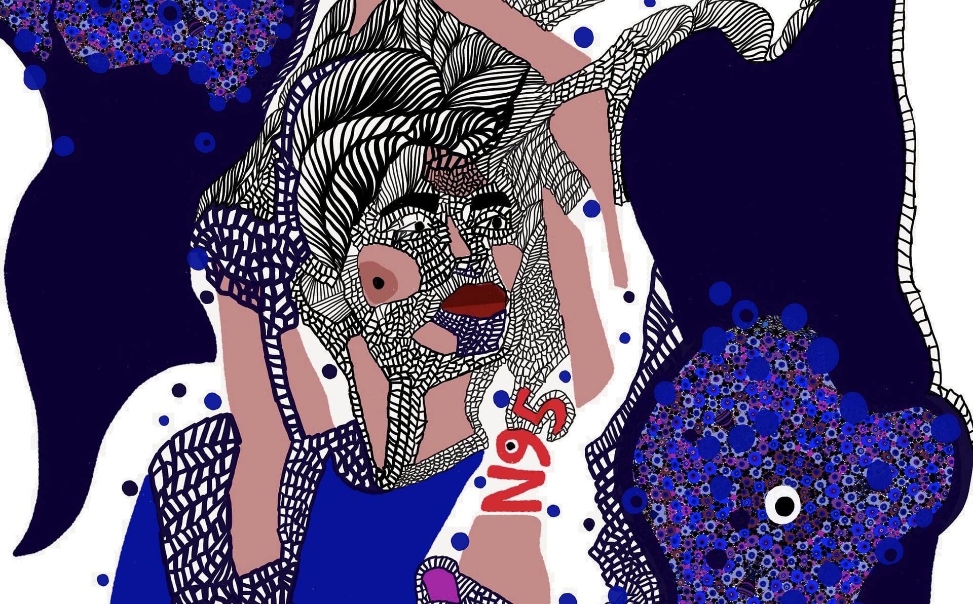
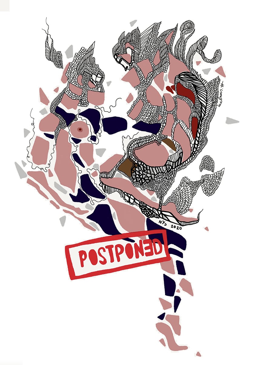
Inspired by the current situation in New York City these illustrations are portraying how it feels to be quarantined. Everything I have been reading lately starts with “ Due to COVID-19.. IT IS CANCELED“
It is time to be sensible and inspire each other.
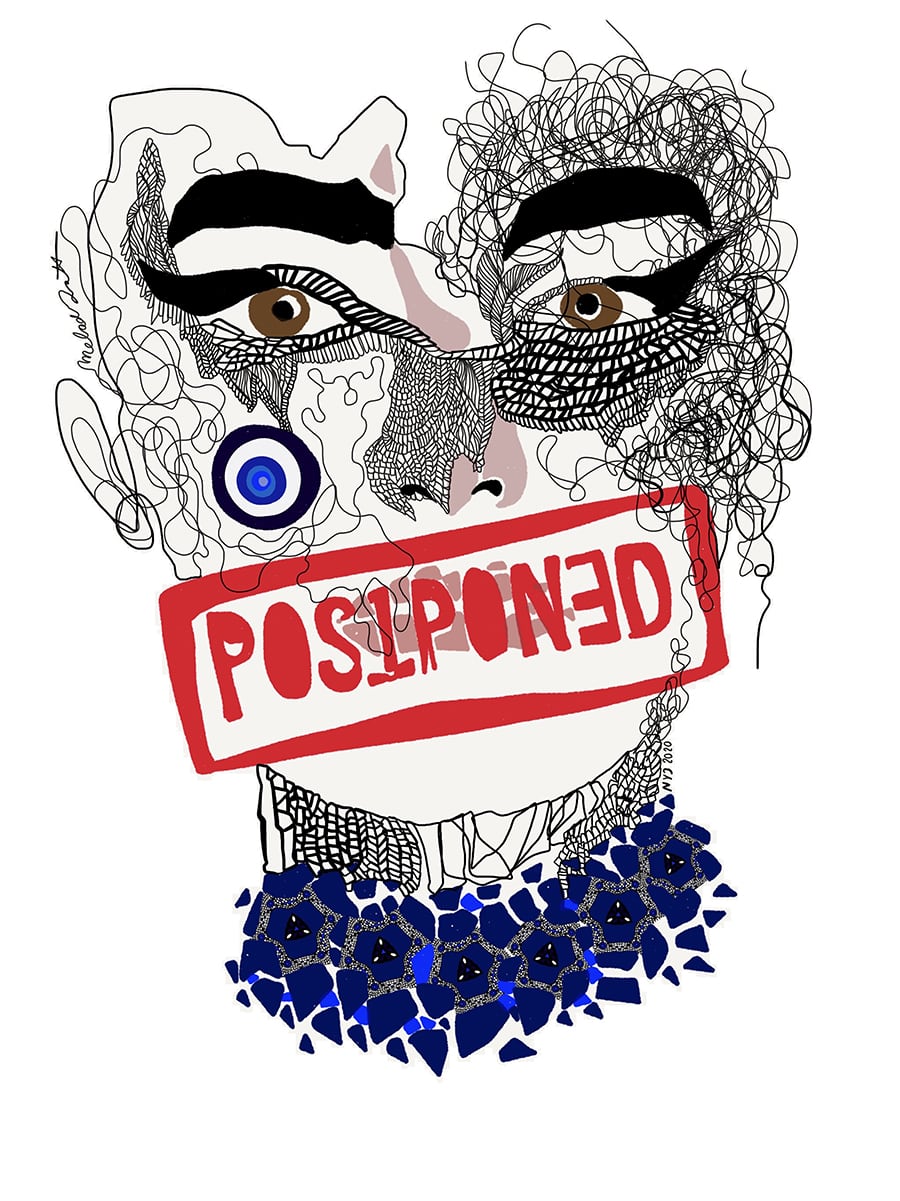
![]() POSTPONED
POSTPONED
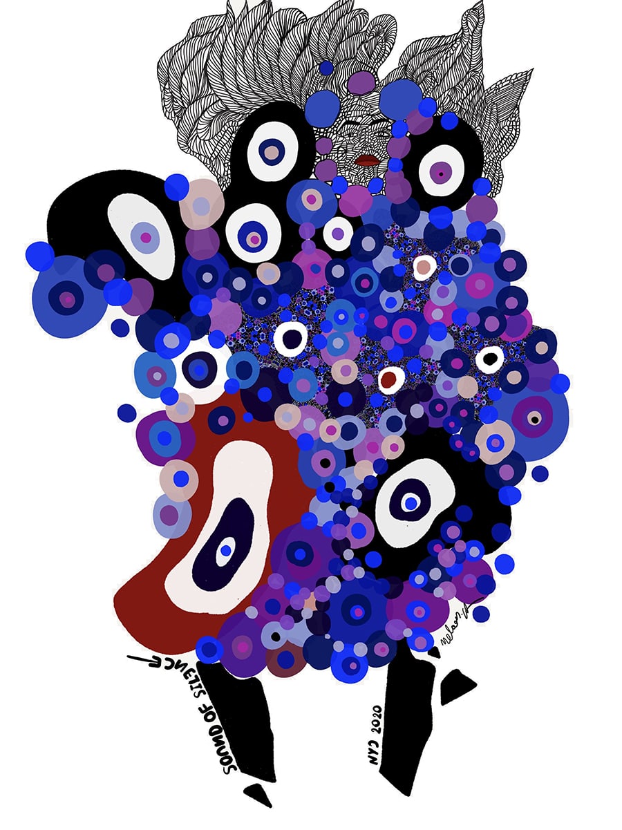
![]() SOUND OF SILENCE
SOUND OF SILENCE
like my other illustrations music was one of the leading forces while creating these illustrations. This time at home on my headphones! But it was still piowerful and magical.
Music has created impetus and inspiration for this series of my fashion illustrations. I wished to produce a pure and transcendental art form and not just use a familiar image! I use music as an analogy or metaphor in my designs and artistic expression. By listening to music and emulating it in my work, I have discovered unconventional techniques in my pattern designs and art-making approach. Like music, my work was created from the depth of my inner self and the purest way to express this is letting the rhythm leads what I draw.
![]() POSTPONED
POSTPONED
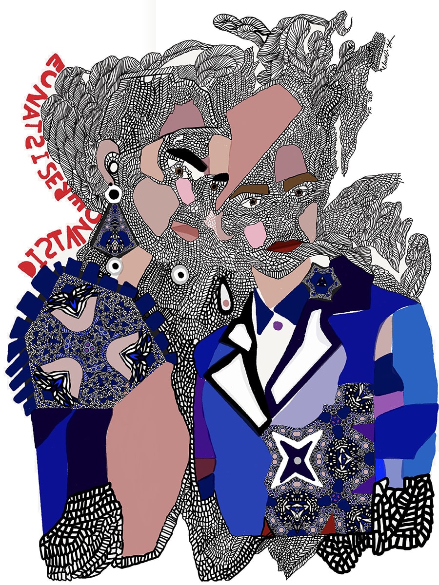
![]() DISTANCE RESISTANCE
DISTANCE RESISTANCE
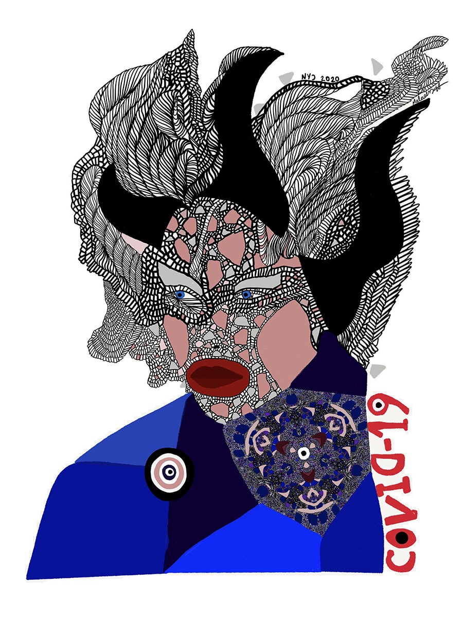
![]() COVID-19
COVID-19
These fashion illustrations are visually communicating the magic of music. You can perhaps dream without words and fly through time and space without moving by looking at them. Some of them were created in different music venues while listening to the music and some are the results of remembering that experience.
IG: @melodyhesaraky
FB: Melody Hesaraky
WB: www.melodyhesaraky.com
TW: @melodyhesaraky
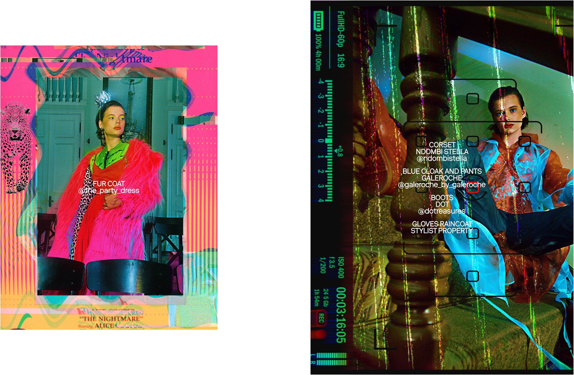
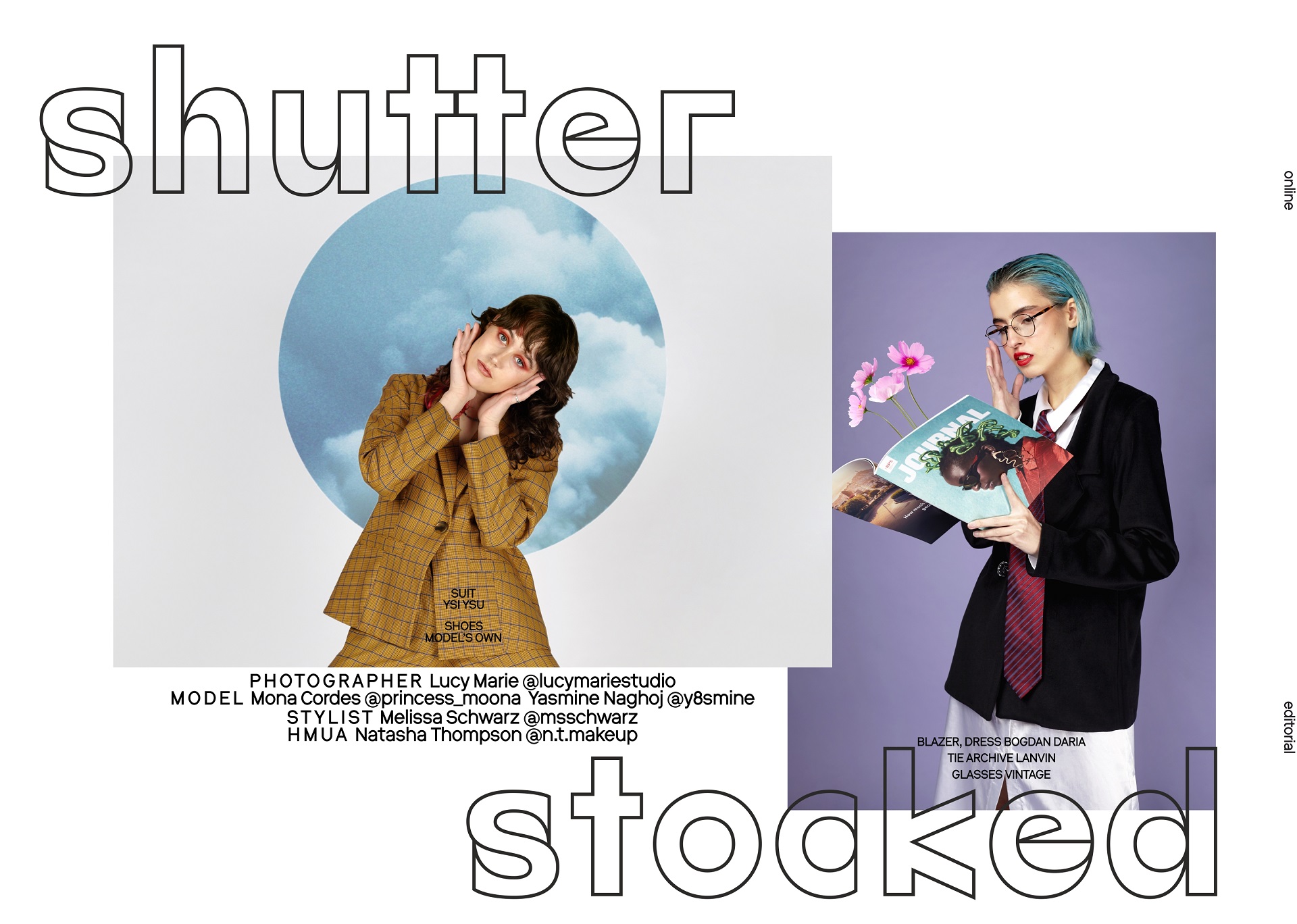
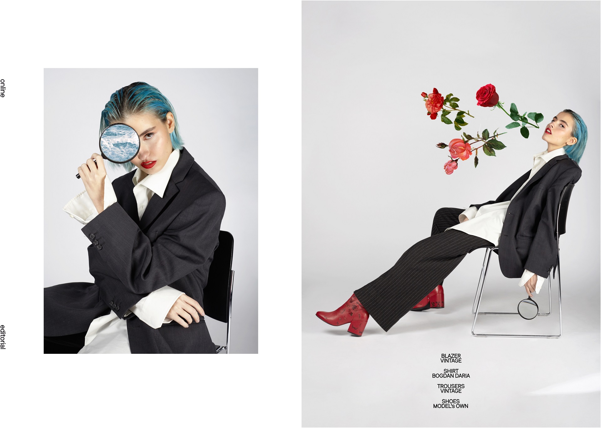
Photographer: Lucy Marie @lucymariestudio
Model: Mona Cordes @princess_moona
Model: Yasmine Naghoj @y8smine
Stylist: Melissa Schwarz @msschwarz
HMUA: Natasha Thorton @n.t.makeup

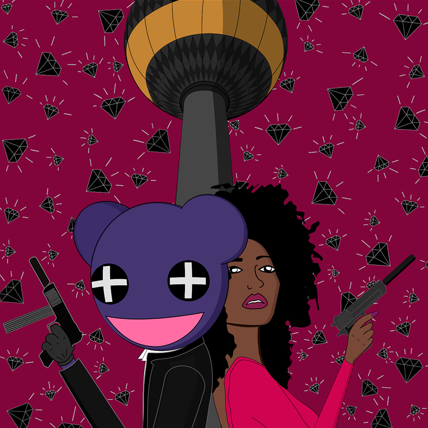
MAXIM KROKIN was born 08/10/1993 in Rostov-on-Don in Russia. At the age of 9
he followed his mother in Naples in Italy where he spent most of his youth ages.
During his teenage years he was involved in a underground scene of skateboarding,
electronic music and graffiti between Naples and Rome. After the High school he
decided to move to Berlin with a desire to become a Music producer and DJ. During
the last 5 years making music in Berlin some how he started to spend more time
working on the covers for his future releases than on music itself, this was a
breaking point in his life where he get caught form art. Some times you will find his
art funny full of colors and some times criticizing the modern society.


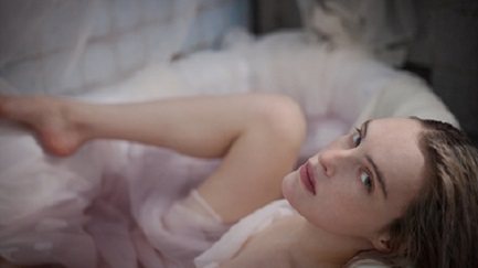
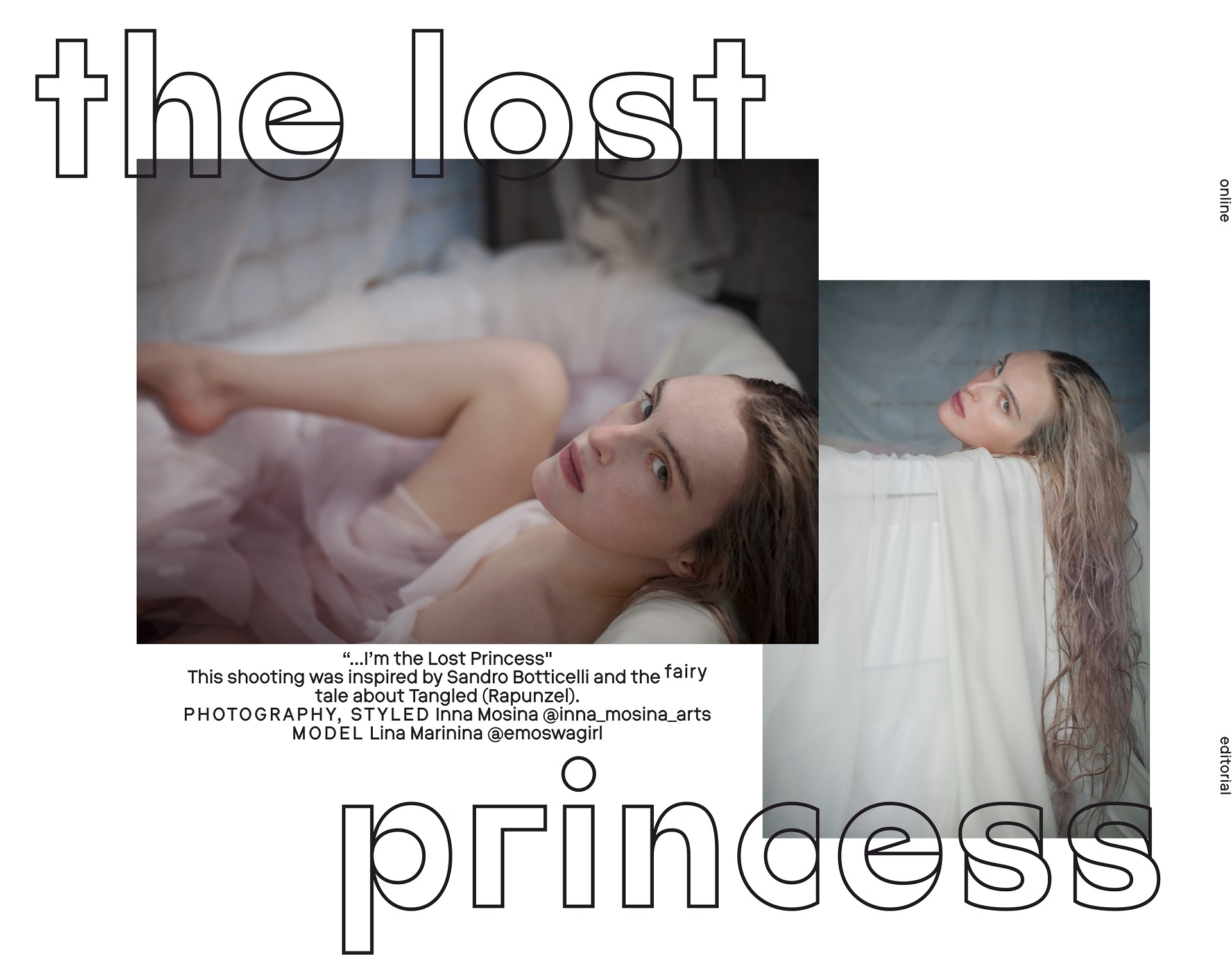
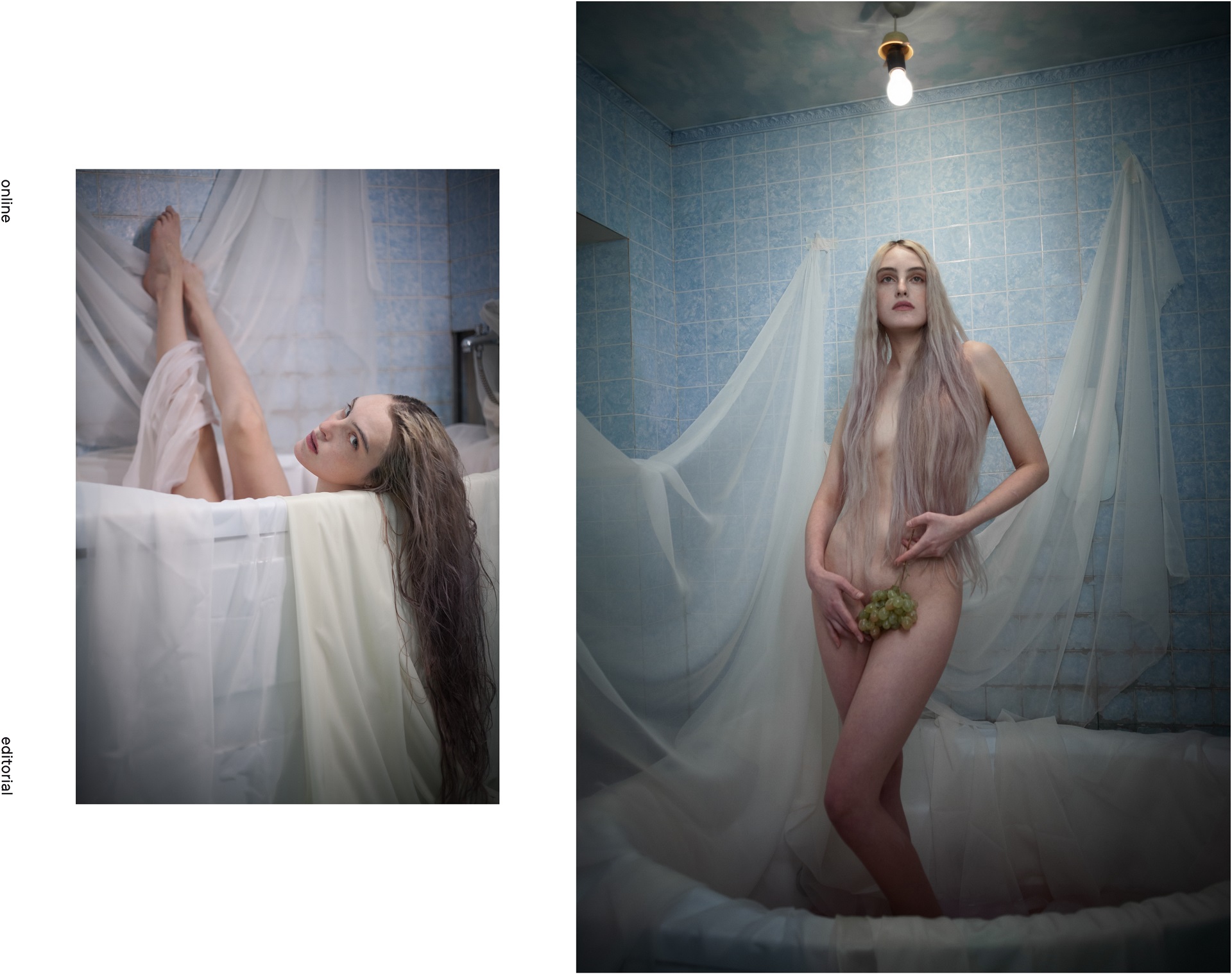
Photography, styled: Inna Mosina @inna_mosina_arts
Model: Lina Marinina @emoswagirl


Neueste Kommentare