

![]() Rocket_Image_Kugeln_04_Janik_Gensheimer_eciRGBv2
Rocket_Image_Kugeln_04_Janik_Gensheimer_eciRGBv2
Text
I r e n R u s s o
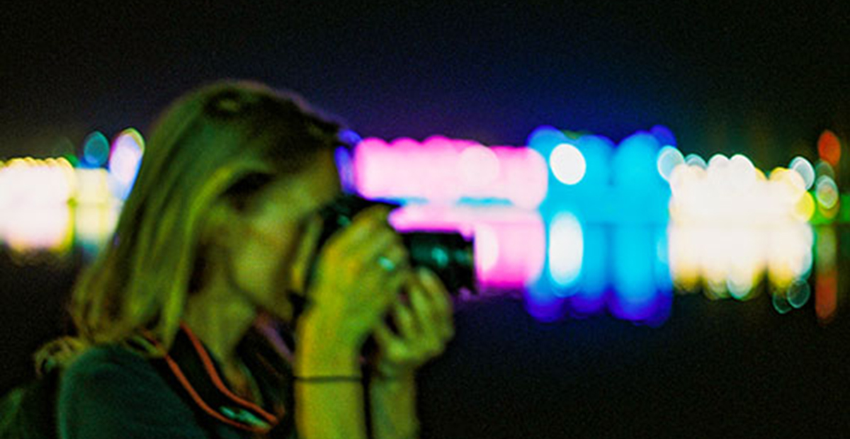
How did you get into photography?
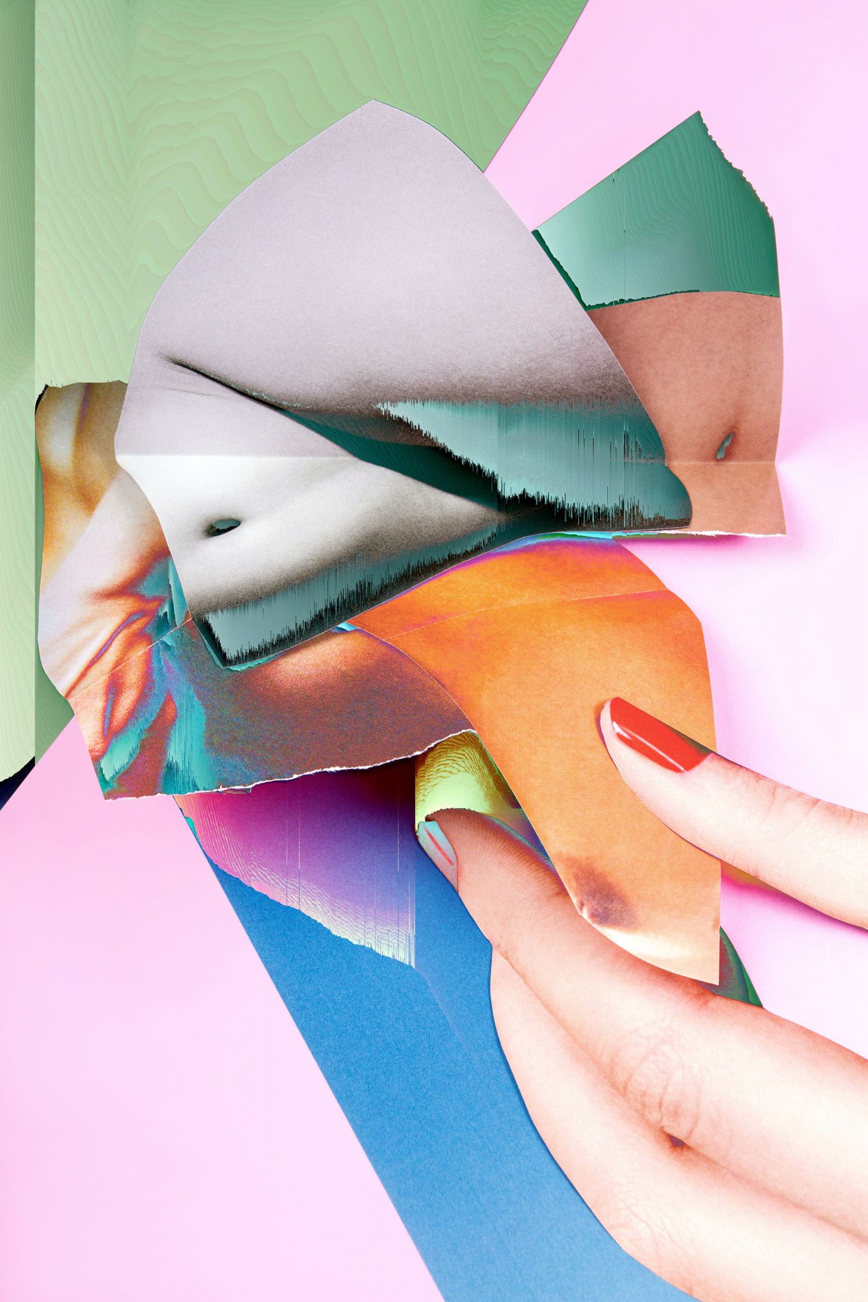
For a school project I started to dig into abstract photography. I got all the books I could get my hands on from the library and spent all summer learning as much as I could about it. In autumn I tried all kinds of abstract photography experiements in my black-out room.
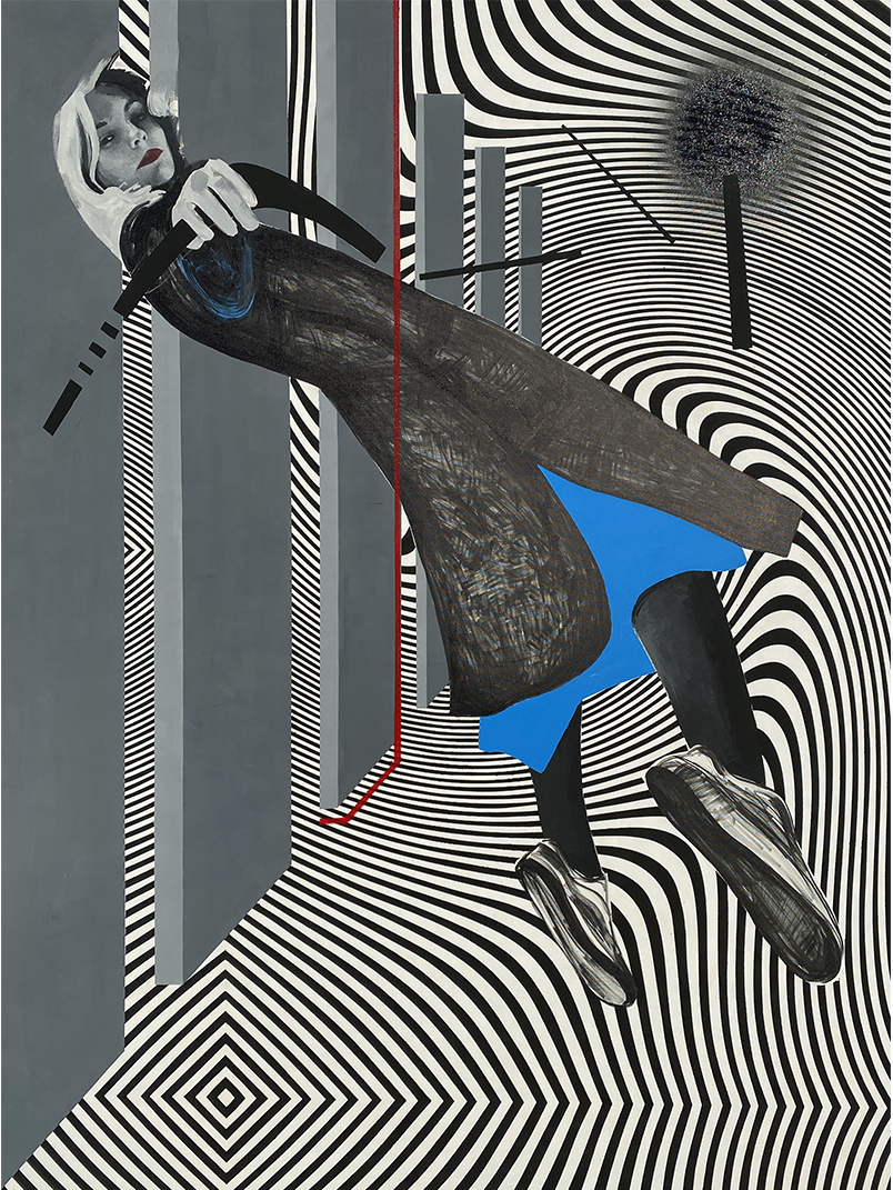
![]() Janik_Gensheimer_03_City_of_Arts_DSC0559_01
Janik_Gensheimer_03_City_of_Arts_DSC0559_01
Can you tell us about the process of making your work?
First of all it needs a great idea. No matter if it’s for a personal project or a job with certain requirements, the idea and the concept are the most important part for a coherent series.
My aim is to implement each job in a way that it’s good enough to make it into my portfolio. I want to create photographs that touch the viewer and create emotions. This cannot be done only through great execution. The content of the picture has to be compelling, has to be new, and polarizing. My photograph is a good one when it makes the viewer pause and provokes a reaction. This is what I’m going for in every photograph I create.
When it comes to architecutal photography the process is a bit simpler. The preparation is a detailed analysis of the building and the location. I then decide on which time of day I have to where and in what weather conditions. Everything else is then created during the process of photography. I try to get a feel for the architect’s idea and bring the three-dimensionality into the two-dimensionality of photography through my clear and simple style. To me, the highest art in photography is to find a clear, unbiased perspective, in which I don’t influence (architectual photography is documentation) while still creating emotions.
![]() Arthur_Laing_Bridge_01X4953_01_Janik_Gensheimer_eciRGBv2
Arthur_Laing_Bridge_01X4953_01_Janik_Gensheimer_eciRGBv2
Do you have a favourite photograph or painting, which inspires you?
Untitled, 1992
Adam Fuss
Which photographer of the past would you most like to meet?
Man Ray
Have you ever had a moment when you questioned your career entirely?
thankfully not. I’ve always known that that’s gonna be my path and my passion.
What advice would you give to a young artist following in your steps?
My own path to being an artist is long from finished. Instead, I’d like to answer this question in regards to a path to photography.
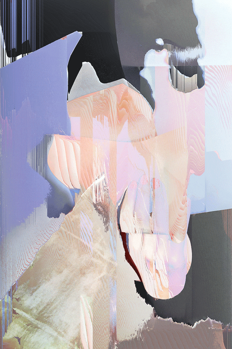
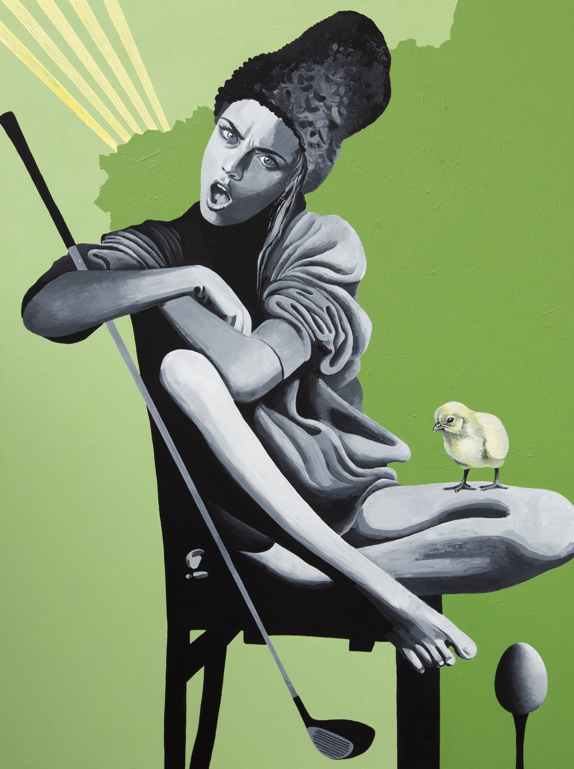
![]() Doppelwort_Eierkopf_02_eciRGBv2
Doppelwort_Eierkopf_02_eciRGBv2
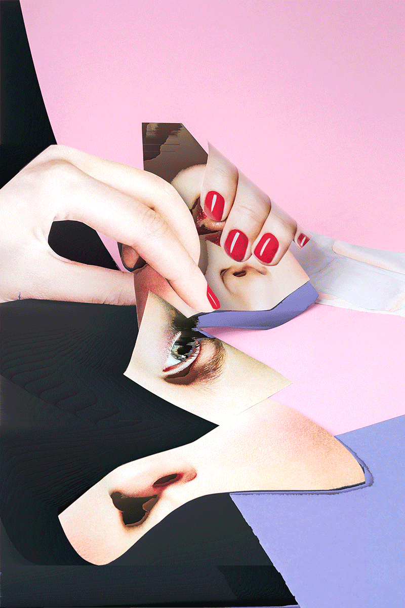
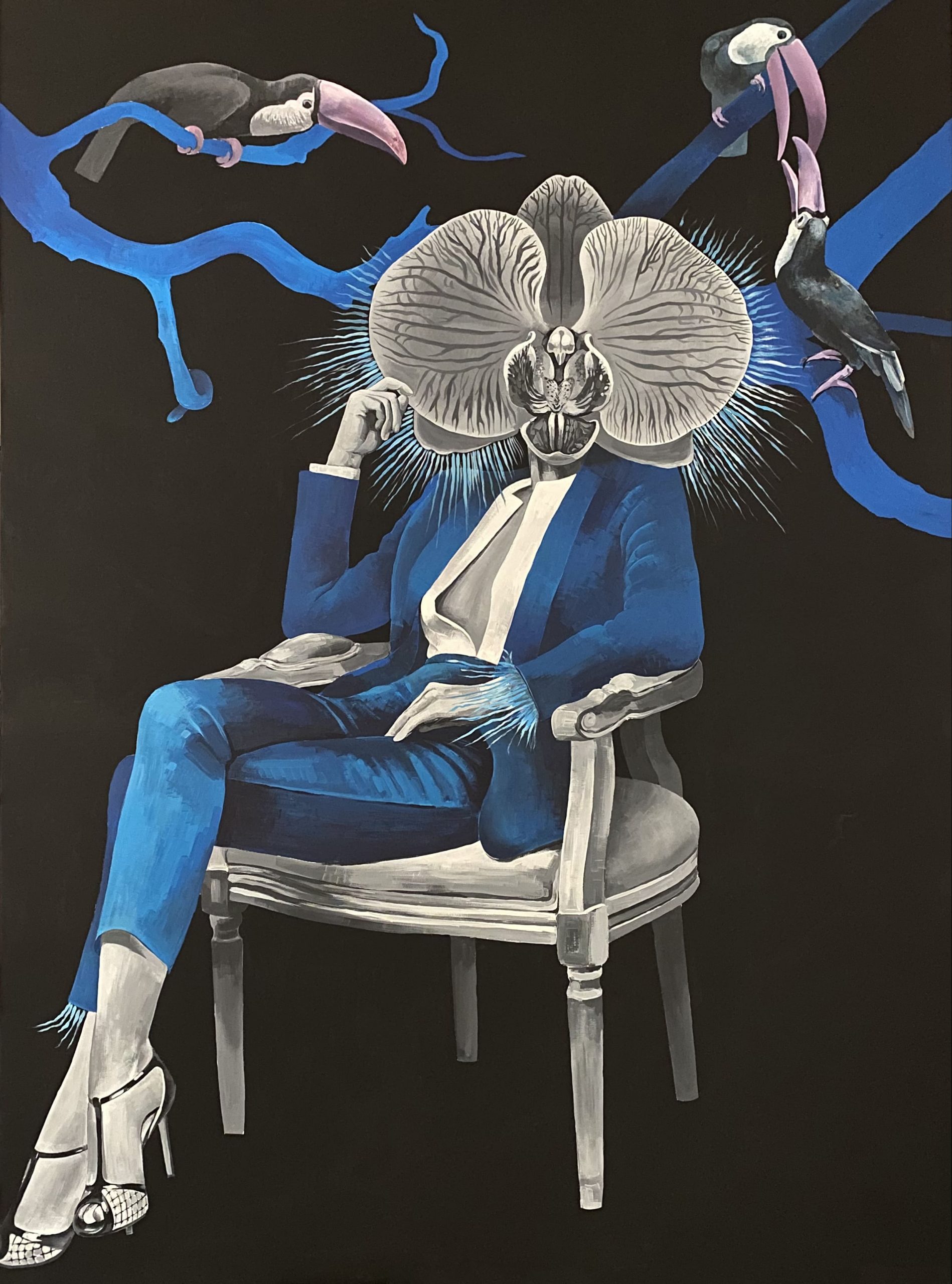
![]() Doppelwort_Fischmesser_02_eciRGBv2
Doppelwort_Fischmesser_02_eciRGBv2
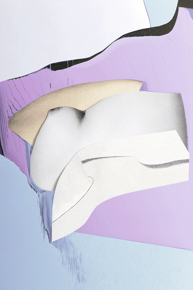
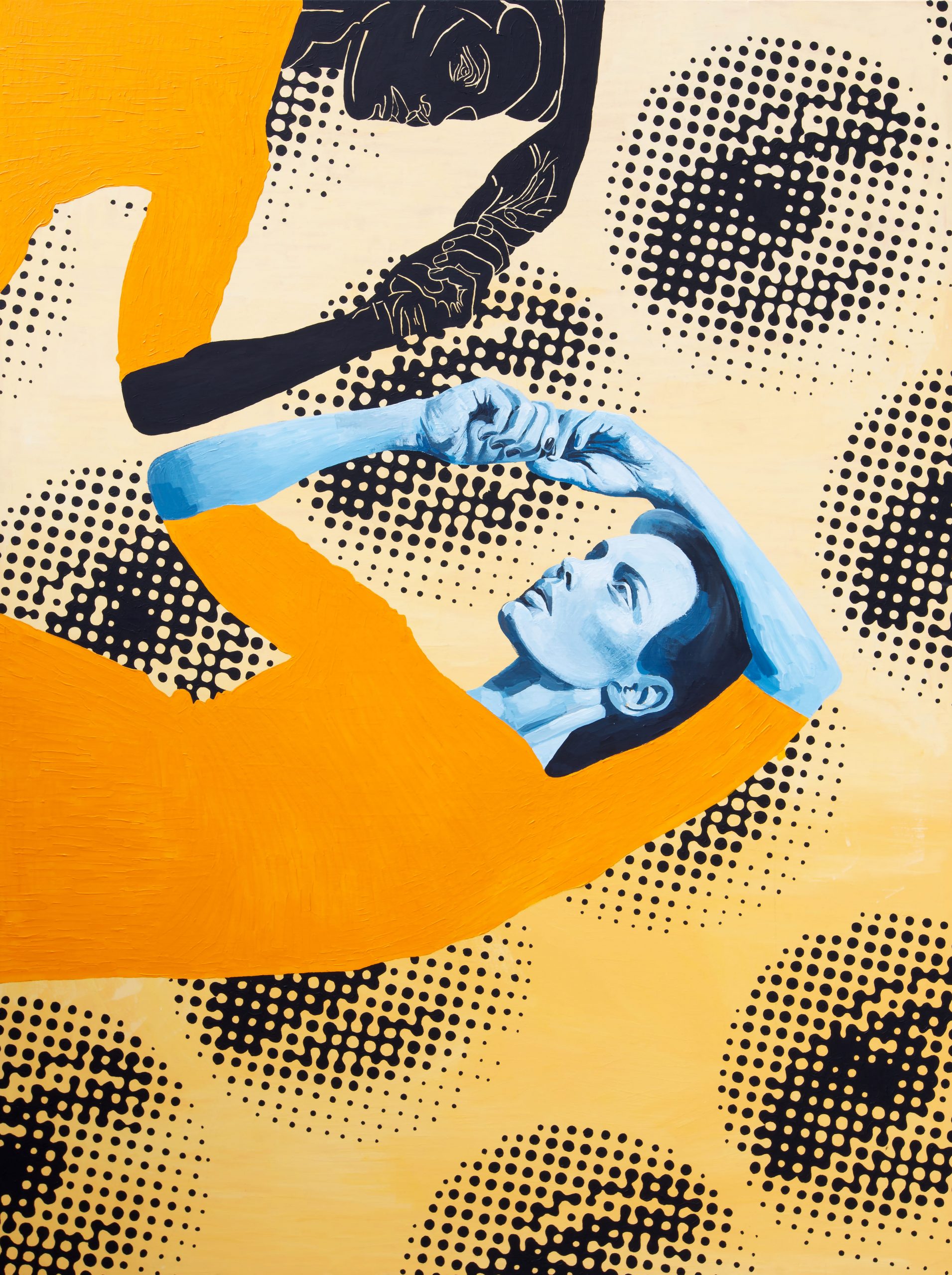
![]() Doppelwort_Schaumschläger_02_eciRGBv2
Doppelwort_Schaumschläger_02_eciRGBv2
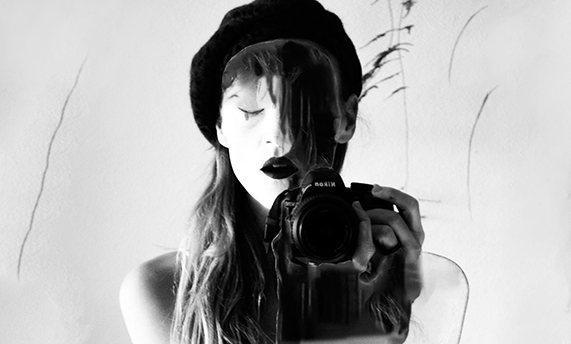
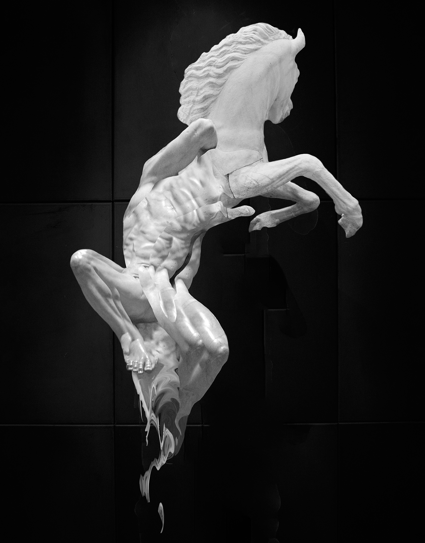
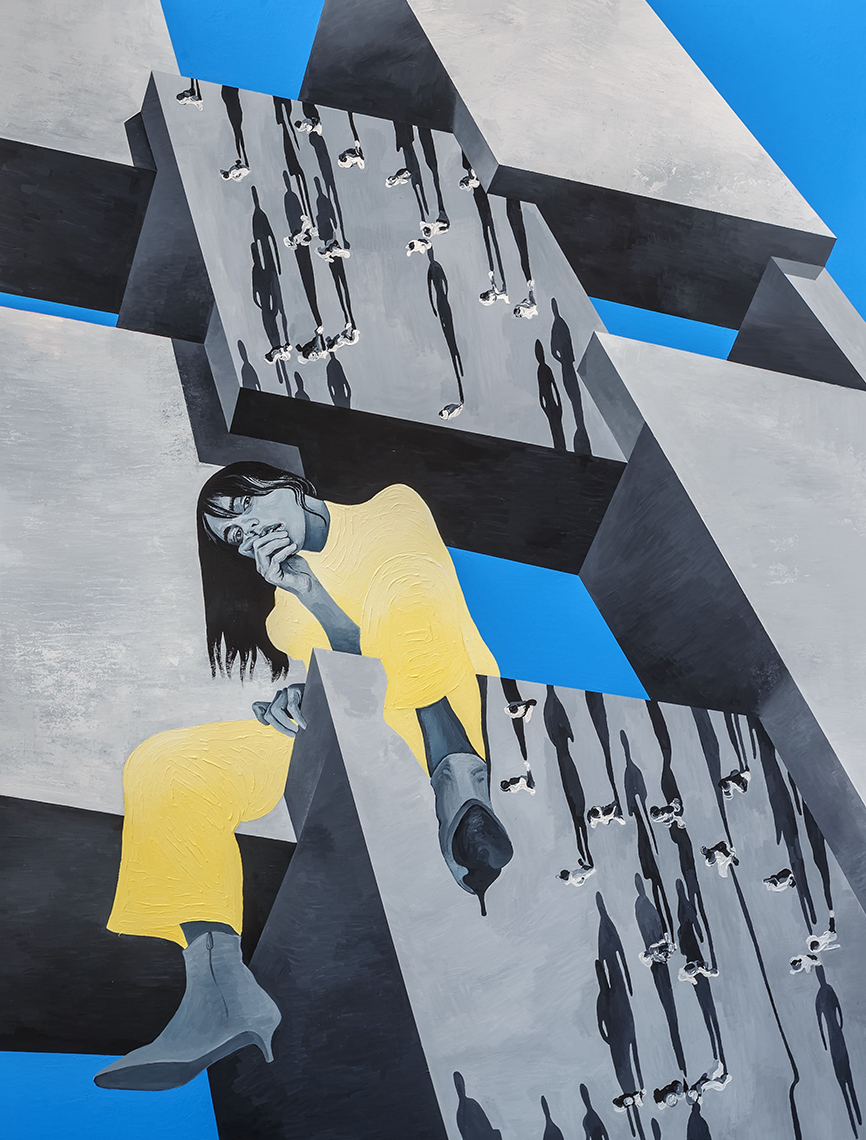
![]() Temptation_black+white_01_eciRGBv2
Temptation_black+white_01_eciRGBv2


Neueste Kommentare